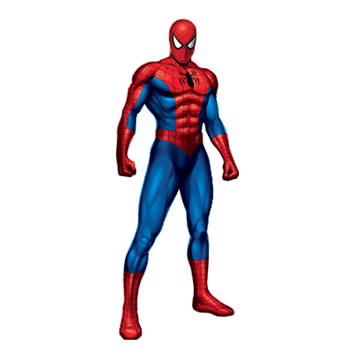
 the main color of my logo is red because its the normal color with superheroes. the color red is the international meaning of stop. the color red hex code I used is #CC0000. My tagline is there is no kryptonite to your knowledge. My logo capture my website because its a book and my website tells about a person with super powers. my website also will feature a storage of data about different superheroes. That's how my logo captures my website. With the rendering process it was actually easy and was painless. the brush tool helped me the most out of anything and completely make my logo look animated. That is how the rendering process is and my useful tool.
0 Comments
my plan for drawing my logo is something that would be imprinted in their head where they will instantly recognize it and make it look smooth and nice.
My first impression of Photoshop element 9 is a cool program to use and I would like to learn more about it. One thing I learned is the four problems non photographers face is organization, how to make the photos look better, how to present the photos in a creative way, and how to share the photos. Three ways to use to edit stuff is to use the tools on the left and the full or quick fix edits. Saturation is the intensity of color and hue is color. the quick selection tool isn't quick because there are faster shortcuts to use so it should be renamed the select tool. One question I have is will we learn how to change a photo entirely so it doesn't look even close to the original?  The first thing I did was select my friends face and change the highlight from 0 to 10. them I deselected the face and then selected the hoodie part of his jacket and changed the shadow from 0 to 8. Finally I used the teeth whiten to whiten his teeth. 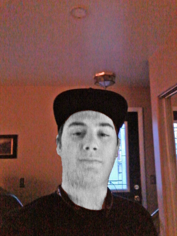 The first the I did was use the smart fix. I then use the red eye remover to remove it. Then I selected my face and turned down the saturation to 0.
|